Introduction To Stock Charts
Basically There Are Three Different Types Of Charts
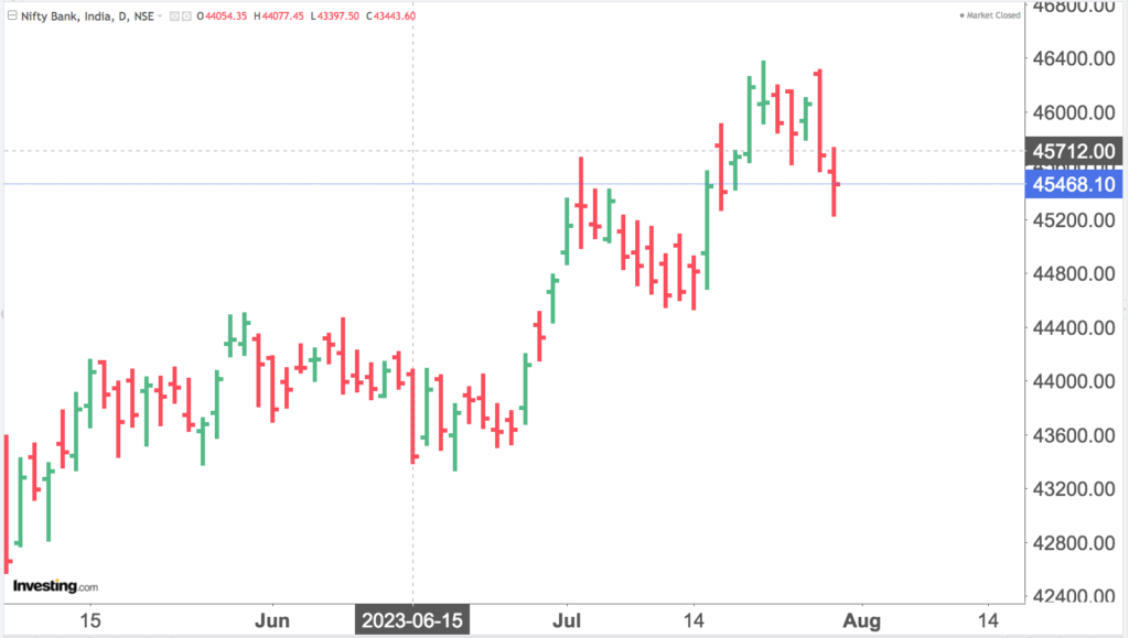
BAR CHART
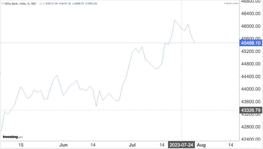
LINE CHART
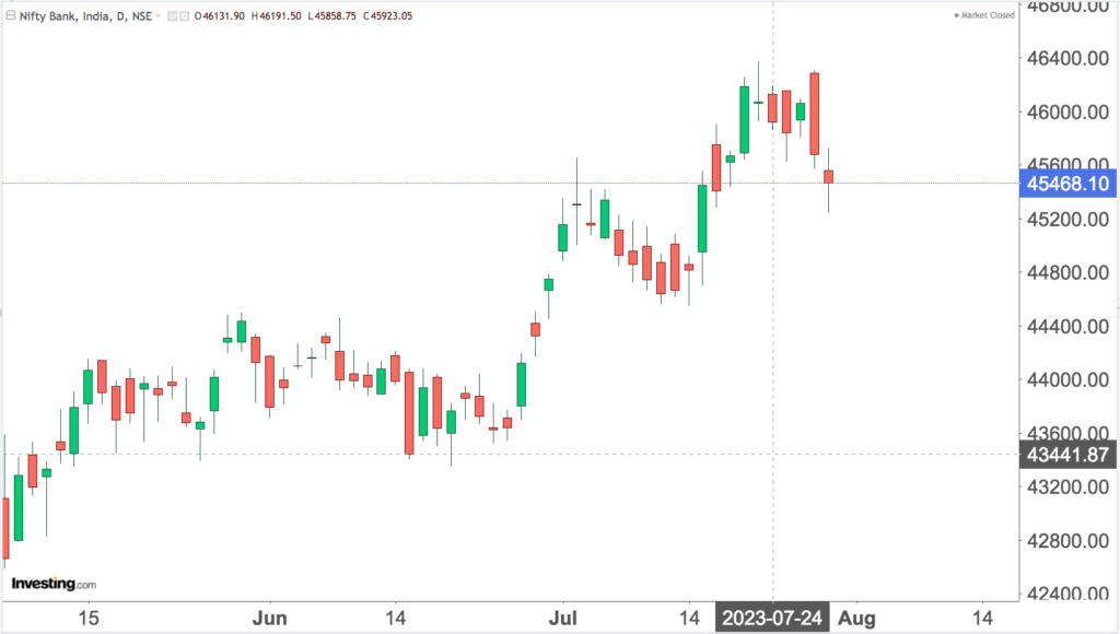
CANDLE STICK CHART
Out of the main 3 types of charts, Candle Stick Charts are the most practical and widely used. Therefore we will discuss the basic structure of the candle stick chart only. A candle stick chart , as the name signifies is made up of “Candle Look Alike” for each time period.
GREEN CANDLE
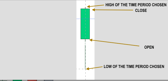
This is when the markets close higher than opening.
In a candlestick chart, a green candle is a type of candlestick pattern that represents a bullish price movement for a specific time period, such as a day, an hour, or any other timeframe used in the chart. The green color indicates that the closing price of the period is higher than the opening price.
On a candlestick chart we have 4 parts in one candle
- Body: The main rectangular part of the candle is called the “body.” For a green candle, the body is filled or colored green. The top and bottom edges of the body represent the opening and closing prices, respectively.
- Upper Shadow/Wick: The thin line or line segment extending from the top of the body is called the “upper shadow” or “upper wick.” It represents the highest price reached during the time period.
- Lower Shadow/Wick: The thin line or line segment extending from the bottom of the body is called the “lower shadow” or “lower wick.” It represents the lowest price reached during the time period.
Naturally the length of the body and the position of the shadows relative to the body provide valuable information about the current market sentiments
- If the green candle has a long body, it indicates a strong bullish momentum, for that period with a significant difference between the opening and closing prices.
- If the green candle has short shadows, it suggests that the price stayed near the open and close during the period.
- If the upper shadow is longer than the body, it shows that the price reached a higher level during the period but pulled back by the end of the period.
- If the lower shadow is longer than the body, it indicates that the price dropped to a lower level during the period but recovered by the end of the period.
THE TWO AXIS OF THE STOCK CHART
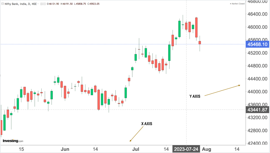
In the figure above , I have pointed out the :Y” axis and the “X” axis
In a stock market chart, there are typically two axes: the x-axis and the y-axis. These axis help to represent and visualize the price and time data of a stock or any other financial instrument. The x-axis is horizontal, while the y-axis is vertical.
- X-Axis (Horizontal Axis): The x-axis of a stock market chart represents time, showing the chronological order of the data points. It is commonly referred to as the “time axis.” Each data point corresponds to a specific time period, which can be minutes, hours, days, weeks, months, or any other chosen time interval, depending on the chart’s timeframe.
For example, in a daily chart, each data point on the x-axis represents one trading day, while in an hourly chart, each data point may represent one hour of trading.
The x-axis is labeled with the corresponding dates or timestamps for each data point, allowing traders and investors to observe price movements and patterns over time.
- Y-Axis (Vertical Axis): The y-axis of a stock market chart represents the price or value of the financial instrument being analyzed. It is commonly referred to as the “price axis” or “value axis.” The y-axis is vertically oriented and spans the price range of the asset being charted.
The scale on the y-axis varies depending on the price range of the asset. For example, in a stock market chart, the y-axis may be labeled with price values in any currency. In the Indian market context it will labeled in indian rupees.
The y-axis also includes markings or gridlines to indicate price levels at specific intervals. These markings assist in determining the price at different points in time and identifying support and resistance levels on the chart.
The combination of the x-axis and the y-axis allows traders and investors to analyze the historical price movements of a stock or any other financial instrument over a given period. This analysis helps in identifying trends, patterns, and potential trading opportunities.
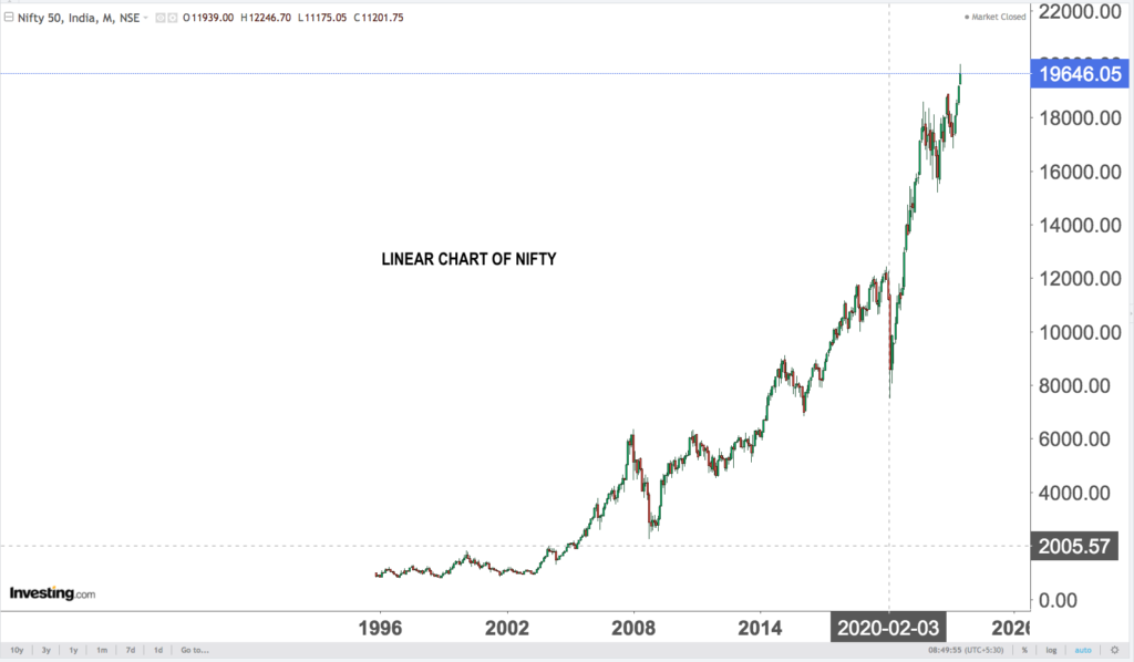
LINEAR AND LOGARITHMIC CHARTS
Basically there are two types of charts depending on HOW the TIME AND PRICE are related.
Below for clarity I will give logarithmic and linear charts for nifty for the same time period and explanation of same
LOGARITHMIC CHARTS AND LINEAR CHARTS BELOW
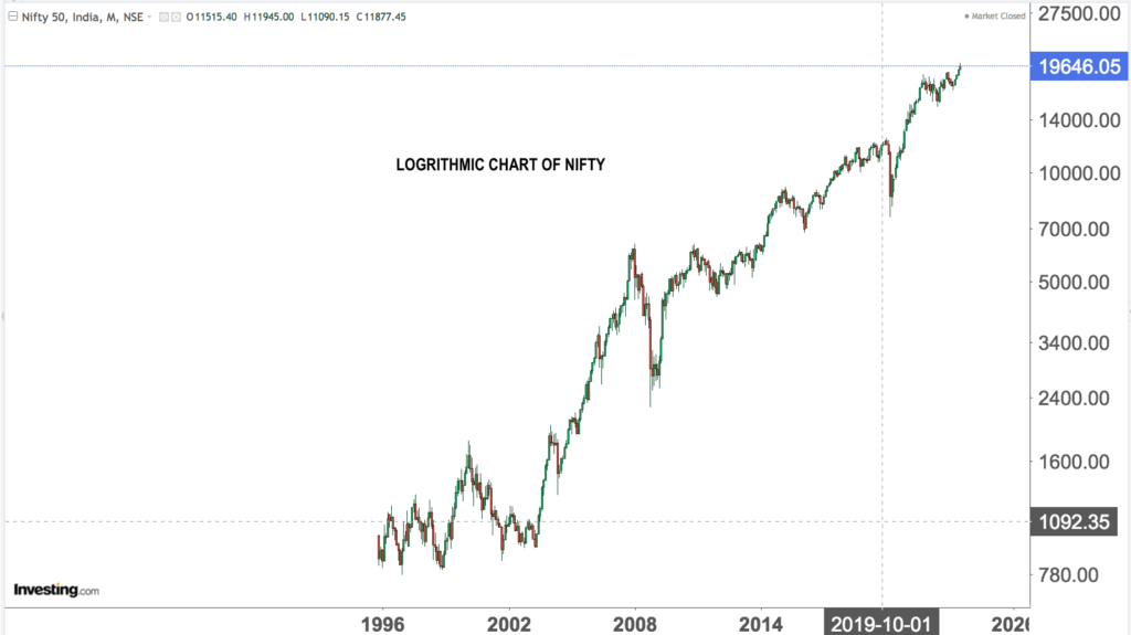
- Logarithmic (Log) Charts: Logarithmic charts, also known as log charts or log-scale charts, display price movements on the vertical (y) axis using a logarithmic scale. This means that equal percentage changes in price are represented by equal vertical distances on the chart, rather than equal absolute price changes.
So both the charts will be distorted from each other.
For chart analysis , it is EASIER TO USE THE LINEAR CHART , Although for longer term perceptive , one can look at a log chart.
The main advantage of using a log chart is that it helps to visualize price movements in percentage terms, making it easier to identify percentage changes over time, especially when dealing with substantial price fluctuations. In a log chart, a large price increase or decrease will be represented as a vertical move, regardless of the absolute price level.
Log charts are particularly useful when analyzing long-term price trends, as they emphasize the percentage change in price, making it easier to spot long-term growth or decline patterns.
- Linear Charts: Linear charts, also known as arithmetic charts or linear-scale charts, represent price movements on the vertical (y) axis using a linear scale. In this type of chart, equal absolute price changes are represented by equal vertical distances on the chart.
Linear charts are straightforward and commonly used to show the absolute price movements of an asset over time. They are especially useful when analyzing short-term price movements or when the price changes are relatively small.